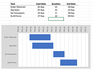
Creating a Gantt chart in Microsoft Excel is easier than you might think! With just a basic understanding of Excel, you can build a clear and effective Gantt chart in about 10 minutes. In this guide, I’ll walk you through the simple steps to create one from scratch.
Step 1: Enter the Task data
The first step is to enter your tasks in table form in Excel. The following four pieces of data are the minimum requirement for a gantt chart, so make sure you have them handy:
- Task list
- Start Date
- Duration
- End Date
Although the third column can be calculated from the first two, all four need to be present for the Excel bar chart to populate correctly. The task names need to go horizontally across the top of the table. Here is an example:
Step 2: Create the Bar Chart
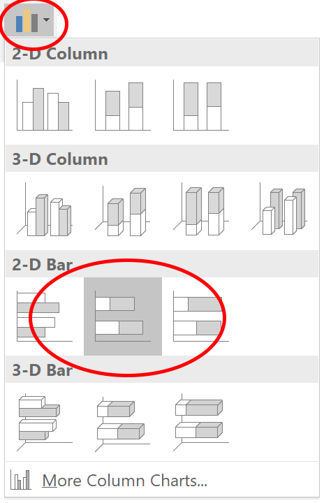
From the menu, choose Insert > Column or Bar Chart > 2D Bar > Stacked Bar. The icons look like this:
![]()
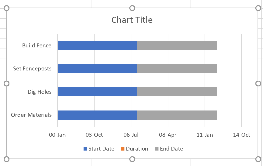
 The chart that is produced will look like this:
 Step 3: Adjust the x-axis
By default, the size of the X axis goes all the way from January 1, 1900 until today! Hence, the duration bars of the individual tasks are tiny and extremely hard to see, if at all. The blue and grey bars represent the time period before and after the individual tasks, respectively. We will remove the formatting to make these transparent, but first we need to fix the x-axis scale.
Unfortunately, MS Excel uses numbered dates which go sequentially and start at zero on January 1, 1900. This makes fixing the X axis a little bit more difficult, but here’s the procedure.
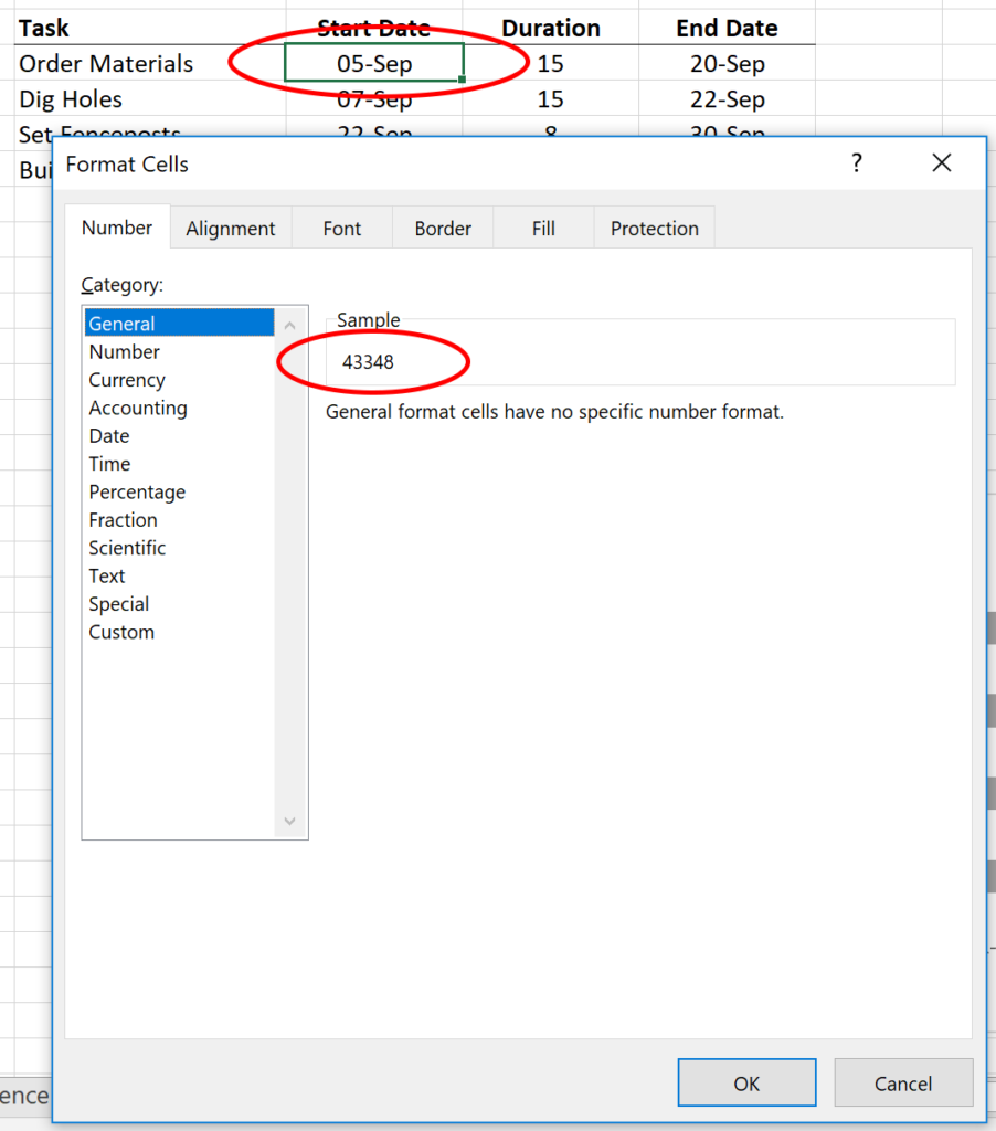
Select the earliest date in the spreadsheet, right-click, and choose Format Cells. Under Number > General, you will see the numerical number for that date. Remember that number or write it down.
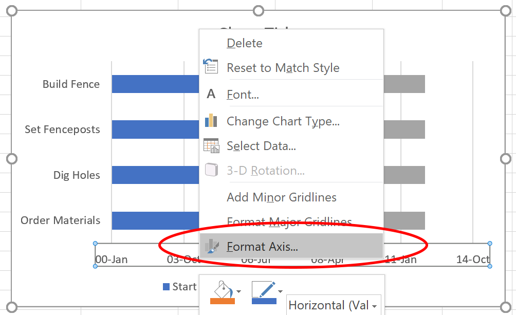
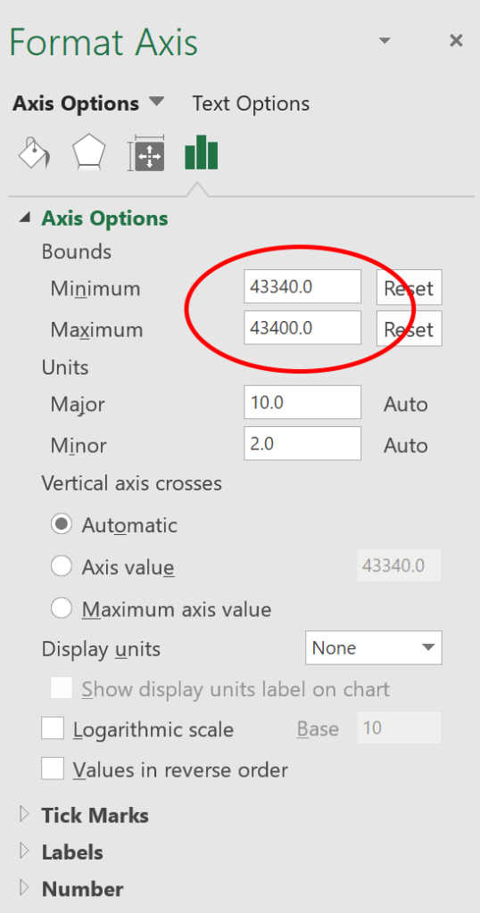
Back at the bar chart, right click on the X axis, and choose Format Axis…
Enter the number you found (the project’s start date) into the box called Minimum. For the Maximum, you will need to find the total project duration (in days) and add it to the minimum. Remember, one integer equals one day.
Step 4: Reverse the Order of the Tasks
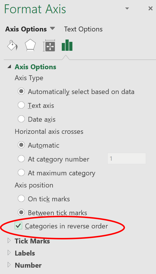
As you can see, the tasks are in the reverse order. To rectify this, right click on the vertical axis and choose Format Axis…
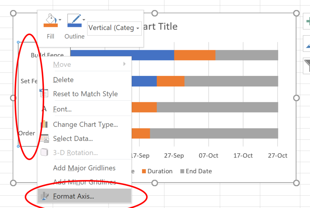
Choose Categories in Reverse Order.
 Step 5: Remove extra bars
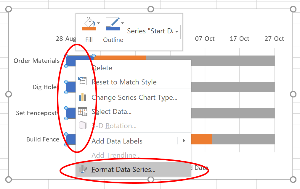
To remove the blue and grey bars on either side of the duration bars, right click on the blue and grey bars and choose Format Data Series…
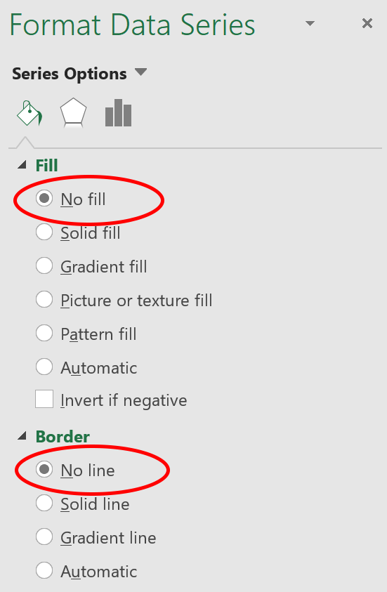
 Choose No fill and No line.
 Step 6: Delete the chart title and legend
Highlight the Chart Title and legend and hit the Delete key![]()

Step 7: Miscellaneous Formatting
In my example, I used the following formatting, but you may wish to adjust this to your preferences:
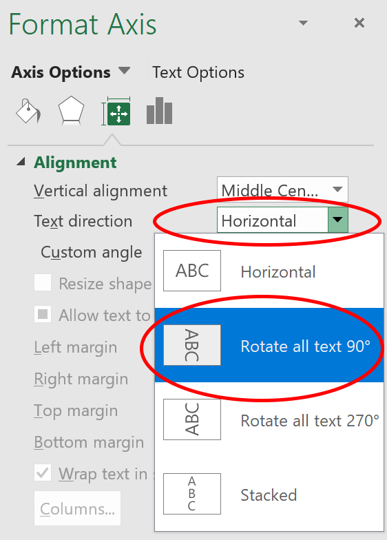
- The x-axis has its text rotated 90 degrees. Right click on the X axis and choose Format Axis… to get the following dialog box:
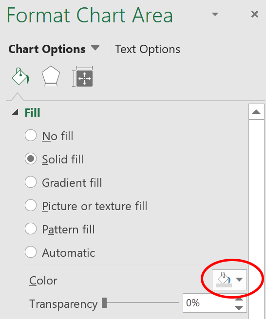
- The main chart area has a grey background. Right click in the chart area outside of the graph, and choose Format Chart Area… to get the following dialog box:
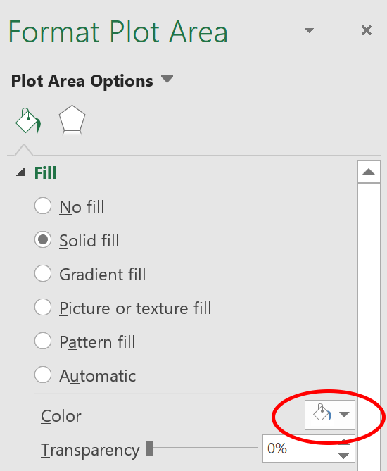
- The interior chart area has a white background. Right click on the interior chart area and choose Format Plot Area… to get the following dialog box:
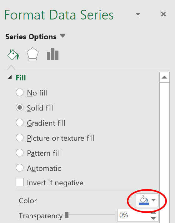
- The duration bars are blue. Right click on the duration bars and choose Format Data Series… to get the following dialog box:
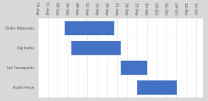
That’s it! You can use Excel’s highly intuitive formatting tools to customize the look and feel just the way you like it.
As you can see, with this procedure it is amazingly simple to:
- Add new tasks. Just insert a new row into the spreadsheet and the chart will update automatically.
- Change task dates. Just change the date in the spreadsheet and the chart will update automatically.
- Format the chart. The options are as limitless as Excel’s formatting options. Change fonts, sizes, bar colors, thicknesses, add gradients, borders, or backgrounds.
- Print the chart. It’s very easy to resize the chart for printing.
Pros
- Time. Even the web applications available today won’t get you a functioning gantt chart this quickly.
- Formatting options. The options for sizes and colors, font styles, gradient or pattern fills, and line thicknesses are superior to any other software out there.
Cons
- The x-axis. It is not very easy to see the chart in the context of months or weeks.
- Printing. You cannot print the chart over more than one page. Since most gantt charts have a long time duration (several months or more), the gantt chart becomes compressed horizontally when squeezed on to one page.




Leave a Reply